OOB with Eduard Express Canopy Mask
Golden Fluid Acrylics, Vallejo Model Color, Gunze metallics
The Kit:
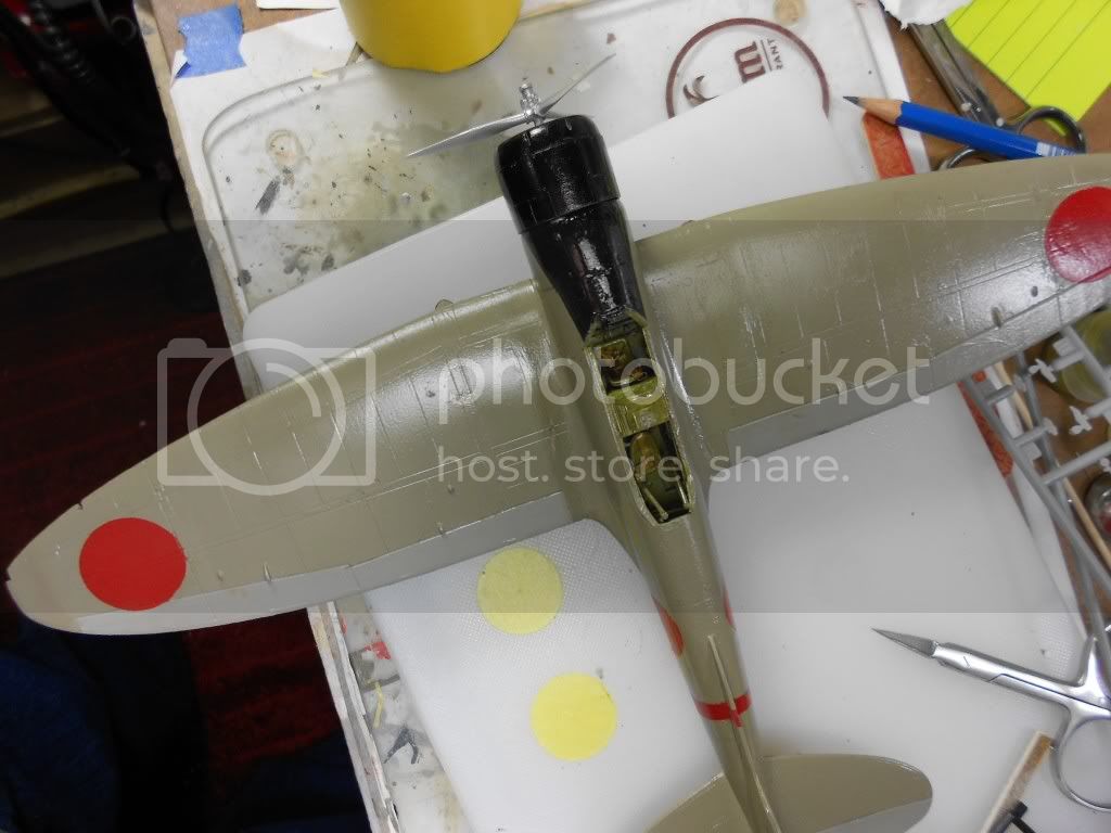
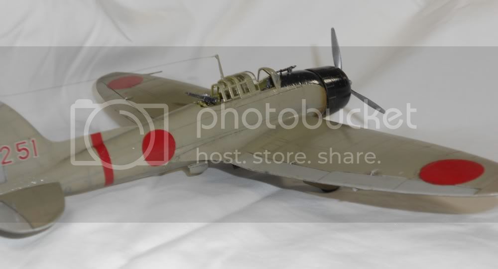
I've been modeling for about two years now. Because I do a sequence of plane/AFV/ship I haven't built very many airplanes considering the time. (May explain why none of them have been anything special.) I counted up everything done in 48 scale and it comes out to be three Eduards, one Zvezda, one Classic Airframe, one Academy and Tamiya's old Ki-84. If you're used to building Eastern European models, imagine the impact of a Hasegawa. It was a little confusing actually. Absolutely everything fit. Although this kit is a little long on the teeth, the part count is 120 and the cockpit pretty detailed. (I saluted the fact by making seatbelts out of fine wire and masking tape. My planes don't go to contests, so I haven't quite seen the wisdom of buying PE sets or resin accessories. But I made seat belts. Nobody will see them, but they're there.) I sat in something like a stupor as a fully assembled cockpit assembly simply popped into the two halves of the fuselage without a whimper. No surgery. Very little sanding. I wasn't sure that I did it right. Everything else was more or less the same. Any problems were do to my tendency to experiment: this time it was using PA as a seem filler. Worked nicely indeed, but as I learned you have to be very careful where the residue ends up. My only quibble is the instructions. They were nicely done but left the one rather complex step of the build inserting the rear gunner's position more or less to the imagination.
I screwed some things up of course because I always do. Hasegawa gives you two complete canopies so you can have it open or nicely tidy when closed. I've never really made a good cockpit, so I thought I'd mask both of them and use the better of the two upon examination. I ended that by losing the front section of the open cockpit: eaten by a snake maybe. (Later in the build both landing lights became laser rockets: I didn't bother to look and used Testor's window maker.) So I amputated the front section of the big canopy so my Val could have it's machine gun. Actually I regret it. As I looked at pictures I decided the Val had cleaner lines with the closed cockpit.
Paint
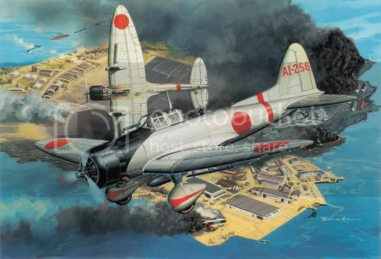
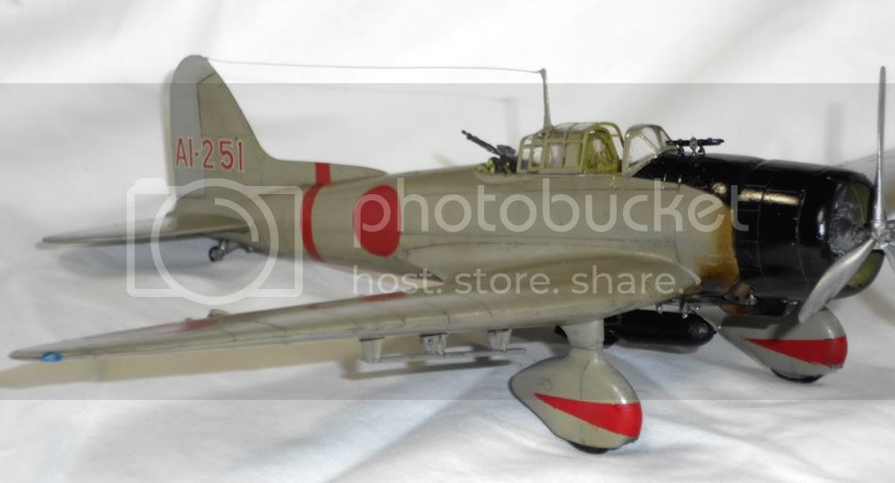
My kit is the Midway Island version so should wear green & grey colors. I've got too many Japanese planes in the stash to do that. So that meant early war amber grey. Which meant getting involved in the great Zero Color Debate that's been going on for twenty years now. I didn't buy PE but I did spend $12 on a splendid booklet Painting the Early Zero-Sen by British modeler Nick Millman. (Nick can be reached at [email protected] ). This is a really neat work: it goes through the whole story of the quibble illustrated with a couple of dozen color chips. Paint freaks will like it because he goes into the strange world of color perception along with Munsell ratings, Federal Standard Numbers, comparisons of both fading and aging. He gives a compelling case for his version of the definitive color and tells the modeler how to alter paints by all of the major manufacturers to get close to Zero nirvana. (From what I can tell, he thinks the LifeColor version of RLM 02 (LC 039) is the best of the lot out of the bottle.) Check it out if you like messing with paints: far more valuable than an Osprey how to book.
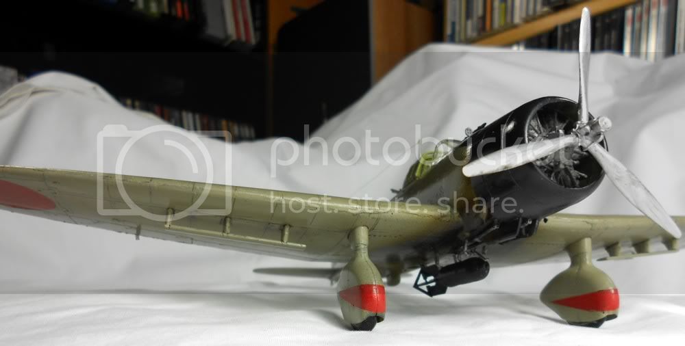
Nick was kind enough to forward a chip for the early war Val which is similar in hue to the Zero but darker. (Vals transitioned to green in stages: some of Hiryu's may have been green at Pearl Harbor. But amber grey was the norm until Combined Fleet returned from Ceylon.) I thought it would be great fun to make my own I have a good supply of Golden Fluid Acrylics and Vallejo Model Color paints and all mix beautifully. The major pigments were neutral grey and ochre. Simple enough, right? Well, there's a reason people have been fighting over the proper Zero color for twenty years plus. Ochre and grey really is code for yellow and black, and that means green. To get the right result I spent four days mixing dozens of colors and I still may have too much khaki in it. Describing this color as complex is an understatement. When it came time to photograph the plane, my little Nikon went nuts trying to figure out how to average the colors almost all of the photos showed too much green. Odd really as there's only a microscopic amount of green in the color. (I think interior yuck green didn't help the camera out any, nor did the weathering. The clearest picture of the color used is probably one below that I took prior to weathering. Some of the details are pretty close too. To my eyes the color used is a kind of tan with a hint of khaki this is adjusted to scale of course.) The cowl is blue/black. The only decals used were the numbers on the tail. Rest of the markings were sprayed on using Floquil Soo Red which is quite dark and was the closest of the seven reds I own to the color of the Japanese national insignia. Although the number indicates a plane from the Kaga, I consider the model a grunt Val from the early war. The decals provided are for the elaborate markings used by squadron or flight leaders. Their followers wore the much simpler attire that I copied. On Milman's advice I painted the control surfaces a color much closer to light grey.
Weathering
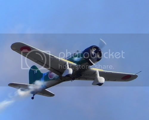
An Osprey book describes the IJN aircraft at Pearl Harbor as pristine. I doubt that very much. The Japanese waxed their aircraft at this stage, hence the satin finish. (I didn't think a true gloss would look right.) That said, Yamamoto had his air groups training intensely in the months leading up to Pearl Harbor. So no doubt nervous aircrew polished away as they steamed toward Hawaii, but the planes available would have been well broken in. More to the point, Kido Butai was very busy the first four months of war more so than any period following. (Oil shortages became an issue as early as fall 1942.) After attacking Pearl Harbor they whacked the Indies, raided Darwin Australia, whacked the Indies again, mauled a British fleet in the Indian Ocean and whacked the Indies. So I was trying to model an aircraft as it would have looked on the way back from Ceylon. Generally, I think this meant a well maintained and well cared for plane, but one with a lived in look. Sort of like a rental car.
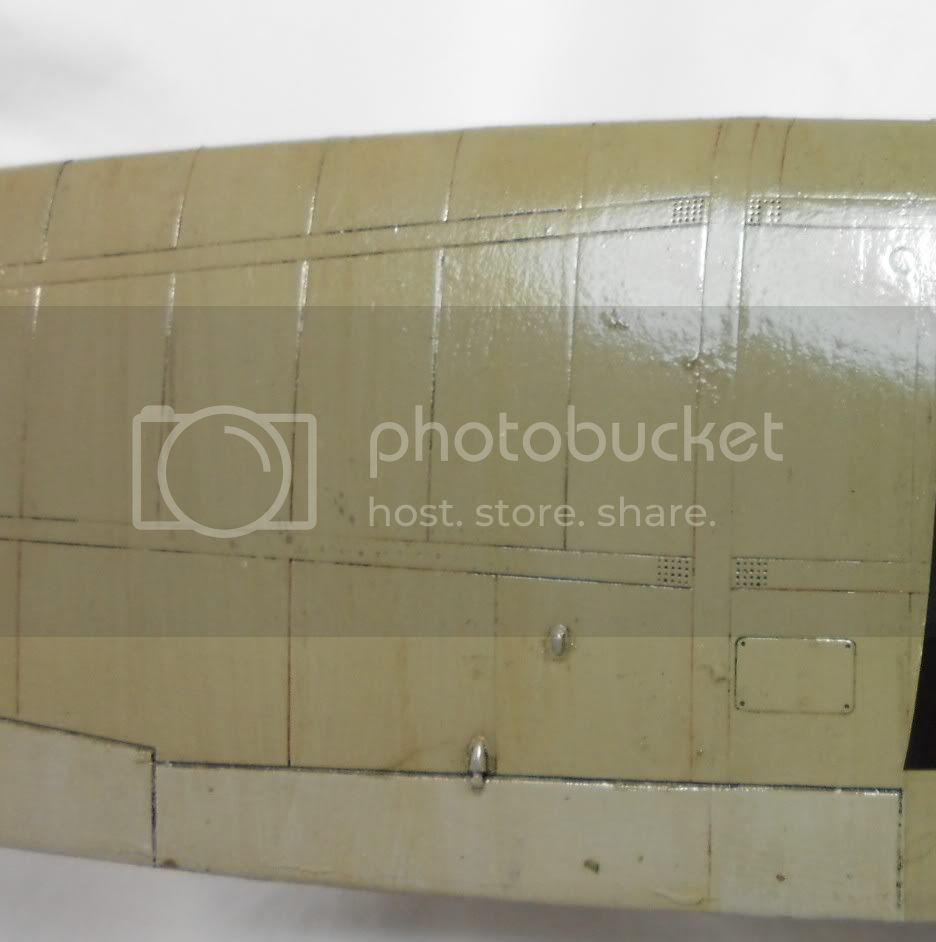
Actually weathering a little is harder than weathering a lot. I did no chipping, although a little probably would have been in order. I didn't want heavy fading so filters and full washes were out. On the other hand, to show some wear and to break the surface colors I decided to give my Val a full plane dot fade with artist oils. (There's a detail photo below of a wing portion: you can see the subtle variations that resulted.) Panel lines confuse me. Are you trying to show shadow or grime? A heavy weather model would invite heavy use of oil washes followed up with pigments as needed. But what about a lightly weathered model? The kind of crisp, precise lines favored by many take real skill to apply. But, frankly, I don't think the resulting models look like real airplanes. I wanted something lighter and more irregular. I did one wing with acrylic inks, something that's worked before. But my pens didn't work with this color. I had better luck with black and brown Verithin artist pencils. (Ship Meister Jim Baumann makes wide use of pencils on his incredible models.) I should have started with them I think it would have looked pretty good. But it clashed with the ink work which clashed with the weird color. So I chickened out and gave the plane a light panel wash of burnt umber/black oils. (For kicks I did some mini streaking using a technique from Gary Edmundson. You put masking tape on a major panel line, put a dot of oil or enamel on it and drag it down with a brush. When you remove the tape, it really does look as though it came from between wing segments.)
On one point I took a different road from other Val builders. I know from past research that radial engines burn oil and Japanese radials were not up to US standards so they burnt even more. I'm convinced that a Japanese aircraft would have shown oil around the cowl and certainly underneath where the Val's exhaust ports point. (Japan's inability to fine tune engine tolerances was the primary reason why a successor to the Oscar and Zero didn't arrive until late 1944 and none were reliable in American terms.) The photo below is a replica but shows how the exhaust was ported and do note the condition of the plane beneath and behind the exhaust. The artist who drew the box art also pictured has it right I think. I almost pulled this one off. I wanted a mix of black, brown, sepia, green and gloss varnish to emulate the odd color oil makes. One of the advantages of Golden paints is that you know the opacity of each color. So I was layering these colors very thin at low psi, dark to light. And like an idiot, the last color applied, which was supposed to be an almost invisible sepia was a fully opaque brown. So, yes, it's too dark. But that was the end of the day and the last thing I had in mind was repainting the wing. Live and learn.
Pics below
Eric
 /
/