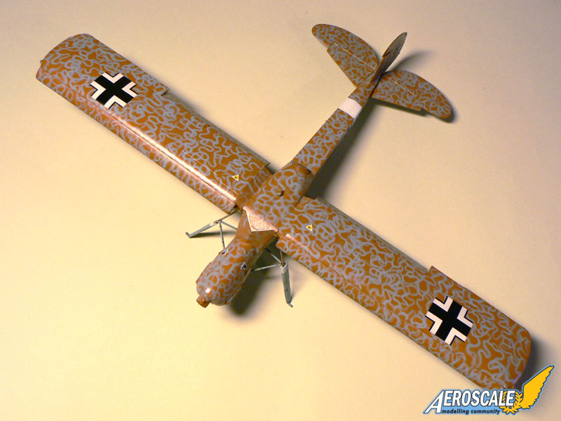
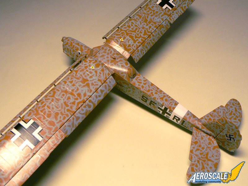
(1) The black of the codes and national insignia has a high contrast with the darker underlying color. Most contemporary pics show a very low contrast between 70/71 and black. This would argue against 70/71. You can't see the 70/71 breaks, but this is often pretty hard to do even in non-oversprayed aircraft.
(2) The canopy frames appear darker than the fuselage paint, but you can't really tell if they are a solid color.
(3) Other pics of Rommel in an unidentified Fi-156 show a very similar tone and clearly show the vermicelli on the frames. May be the same aircraft, may not be.
(4) A clear pic of a solid sand upper Fi-156 from the same unit show a very very light overall appearance - which our subject does not.
Ortho film would cause the yellow-tan to appear darker and the light blue to appear lighter - leading to the high contrast of the other photo in the HS thread if it were light blue over sand.. No telling what film was used.
"Recon for Rommel" does have some great color pics - but only one of a Storch IIRC, unfortunately. ( Interesting color cover photo shows quite a difference between the Hs-126 and the Caproni re. the "sand" color )

I was initially in the 70/71/65 camp, but I'm really no longer as certain -Tamiya's guess is as good as any of ours.