_GOTOBOTTOM
Early Aviation
Discuss World War I and the early years of aviation thru 1934.
Preshading overpainted areas
JackFlash
_VISITCOMMUNITY
Colorado, United States
Joined: January 25, 2004
KitMaker: 11,669 posts
AeroScale: 11,011 posts
Posted: Tuesday, December 22, 2009 - 07:21 PM UTC
On the subject of preshading of simulated overpainted fabric areas.

Representing internal wing rib preshading on CDL areas is fine. But IMHO on overpainted upper surfaces it is fantasy. All you would have in these areas is raised areas highlighted by sun or surface exhaust residue. The factory or in the field applied coat of paint would not be translucent enough to show interior shadowed areas.

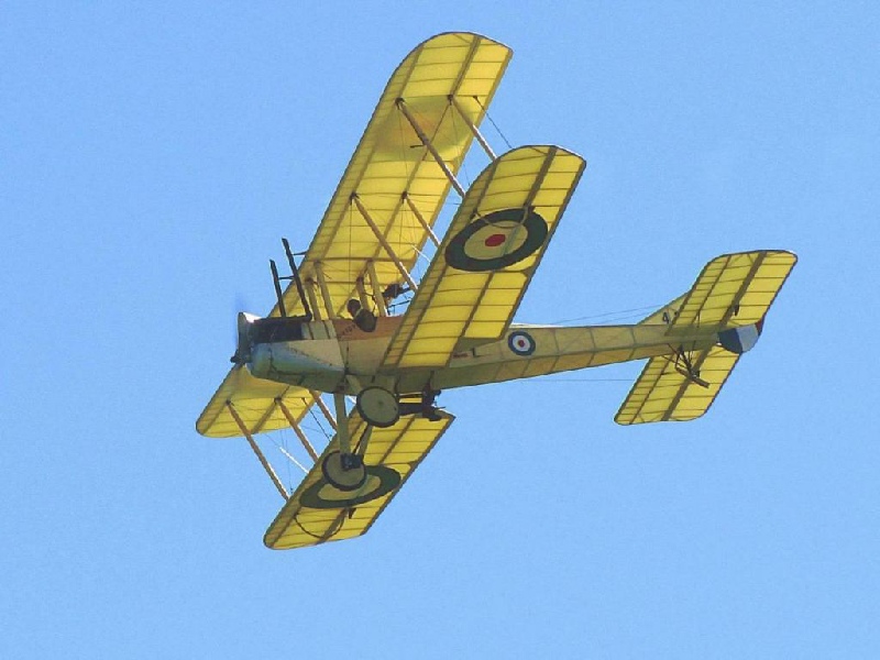
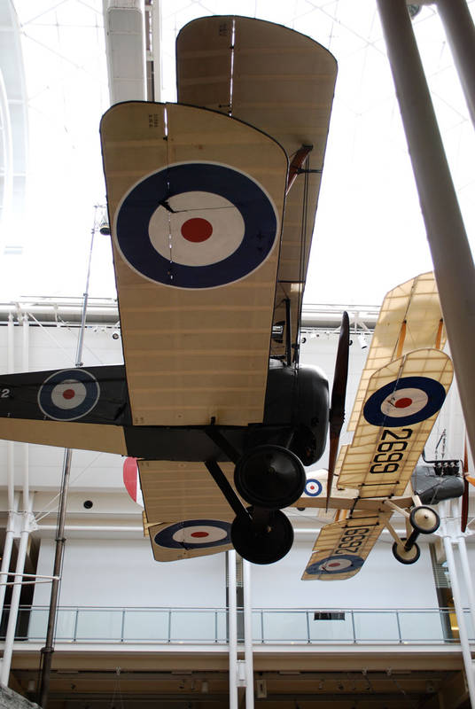
Now having said that, We also must understand that dark areas tend to show up when the overall paint coating starts to wear thin due to in service usage and weather exposure. This is due to the dope and varnish being locked in to the fabric strips that were applied before the fabric covering was sewn and nailed in place. The lose of pigment from the flexible surrounding areas tends to show the ribs and spars up in darker pattern. Note the image below from Rosebud's website. This bird has clearly undergone some repainting, repair work on the upper wing outer panel. But note the original center section.


Again, factory painted upper wing surface will start to show dark areas on the ribs and spars when - the overpainted areas are subject to age, in the field paint consistancy variations, and in service weather exposure.

In this case the covering looses its opaque(solid or uniform)colouring as the paint wears off. The dark aras are due to the dope being locked into the second layer of fabric strips that were attached to the ribs and spar faces. These were attached before the fabric covering was attached doped and varnished and painted.
JackFlash
_VISITCOMMUNITY
Colorado, United States
Joined: January 25, 2004
KitMaker: 11,669 posts
AeroScale: 11,011 posts
Posted: Tuesday, December 22, 2009 - 08:00 PM UTC
Note this Camel on its nose. See how the undersurface fabric strips are prominent.

robot_
_VISITCOMMUNITY
United Kingdom
Joined: March 08, 2009
KitMaker: 719 posts
AeroScale: 691 posts
Posted: Tuesday, December 22, 2009 - 09:09 PM UTC
A very interesting and contentious topic Stephen.

There is a difference between painting to represent the colours and brightness of the aircraft, and painting to represent the appearance of an aircraft under specific lighting conditions. And even after that choice, some effects can make an aircraft look more interesting, even if it is not realistic- e.g. the almost ubiquitous preshading of panels on models of metal skinned aircraft that is rarely seen in real aircraft.

Going back to purely simulating lighting effects, in that first photo, the most prominent shading of the upper painted surfaces is the the dark bar along the lower leading edge, and the brightly highlighted parts of the (damaged?) cloth over the ribs in the centre section. Unless you view your models outside, and in direct sunlight, you are unlikely to seen either effect as strongly (the size of a model means that it gets more reflected light reaching it for the ground around it, and nearby objects, reducing contrast). If you were able to shrink the Camel in the first photo, and re-photograph it, the shading on the wings would be reduced.

I agree that using the same techniques that you would apply to the undersurface to achieve a translucency effect is wrong for the uppers, but I don't think all masking of ribs or other ways of shading to represent lighting is inherently inaccurate for the upper surfaces.
CaptainA
_VISITCOMMUNITY
Indiana, United States
Joined: May 14, 2007
KitMaker: 3,117 posts
AeroScale: 2,270 posts
Posted: Wednesday, December 23, 2009 - 09:51 AM UTC
I have taken a very long look at the British Aircraft on the Wingnut site. The Wingnut built SE 5a specifically. The shading they obtained on the undersurfaces, to me, is fantastic.

So how realistic is it? and How can it be done by somebody with modest skills?

Hey, you opened yourself up on this one, Stephen.
JackFlash
_VISITCOMMUNITY
Colorado, United States
Joined: January 25, 2004
KitMaker: 11,669 posts
AeroScale: 11,011 posts
Posted: Wednesday, December 23, 2009 - 11:50 AM UTC

Quoted Text

I have taken a very long look at the British Aircraft on the Wingnut site. The Wingnut built SE 5a specifically. The shading they obtained on the undersurfaces, to me, is fantastic. So how realistic is it? and How can it be done by somebody with modest skills? Hey, you opened yourself up on this one, Stephen.


You Don't think I would open this can of squiggles with out having a few things up my sleeve?
RAGIII
_VISITCOMMUNITY
North Carolina, United States
Joined: June 19, 2007
KitMaker: 604 posts
AeroScale: 600 posts
Posted: Wednesday, December 23, 2009 - 02:46 PM UTC
Along those lines I have noted that other than Lozenge rib tapes, and a few other anomalies,rib tapes usually appear darker. Perhaps from catching oil and dirt? Structure very rarely is evident. JMHO,
RAGIII
lcarroll
_VISITCOMMUNITY
Alberta, Canada
Joined: July 26, 2010
KitMaker: 1,032 posts
AeroScale: 1,025 posts
Posted: Monday, December 27, 2010 - 05:24 AM UTC

Quoted Text


Quoted Text

I have taken a very long look at the British Aircraft on the Wingnut site. The Wingnut built SE 5a specifically. The shading they obtained on the undersurfaces, to me, is fantastic. So how realistic is it? and How can it be done by somebody with modest skills? Hey, you opened yourself up on this one, Stephen.


You Don't think I would open this can of squiggles with out having a few things up my sleeve?


Can't wait Stephen. Out with it! A "how to" thread would be most welcome and timely for my situation as a recent returnee to the hobby.
Cheers,
Lance
JackFlash
_VISITCOMMUNITY
Colorado, United States
Joined: January 25, 2004
KitMaker: 11,669 posts
AeroScale: 11,011 posts
Posted: Monday, December 27, 2010 - 05:41 AM UTC

Quoted Text

Along those lines I have noted that other than Lozenge rib tapes, and a few other anomalies,rib tapes usually appear darker. Perhaps from catching oil and dirt? Structure very rarely is evident. JMHO,
RAGIII


Not so much form oil & dirt but its more because your doubling the density of fabric in this area by laying down rib tapes over the basic covering. Sewing the tapes down then doping over that intensifies the colours.
wombat58
_VISITCOMMUNITY
New South Wales, Australia
Joined: March 26, 2009
KitMaker: 366 posts
AeroScale: 309 posts
Posted: Saturday, January 01, 2011 - 01:42 PM UTC
Here's a classic example of light passing through the fabric and showing the ribs/spars as dark areas.

thegirl
_VISITCOMMUNITY
Alberta, Canada
Joined: January 19, 2008
KitMaker: 6,743 posts
AeroScale: 6,151 posts
Posted: Saturday, January 01, 2011 - 03:07 PM UTC

Quoted Text

Here's a classic example of light passing through the fabric and showing the ribs/spars as dark areas.


That is a wonderful view ! Having the light pass through the fabric really shows off the details .
OEFFAG_153
_VISITCOMMUNITY
Västra Götaland, Sweden
Joined: February 19, 2010
KitMaker: 1,473 posts
AeroScale: 1,450 posts
Posted: Saturday, January 01, 2011 - 10:10 PM UTC
Wow – Thats a beautiful picture

– I wonder if/how it would be possible to recreate the faint shadow of the upper national markings seen through the wing?

Mikael
JackFlash
_VISITCOMMUNITY
Colorado, United States
Joined: January 25, 2004
KitMaker: 11,669 posts
AeroScale: 11,011 posts
Posted: Sunday, January 02, 2011 - 03:08 PM UTC
For clear doped linen the shadows can easily be reproduced by preshading. But this thread is a commentary on preshading areas that are to be painted opaque camouflage colour(s).
CaptainA
_VISITCOMMUNITY
Indiana, United States
Joined: May 14, 2007
KitMaker: 3,117 posts
AeroScale: 2,270 posts
Posted: Monday, January 03, 2011 - 05:35 AM UTC
PC10 is a color that everybody has an opinion on, and it seems no two modelers use the same shade, and yet everybody is correct. So I have another can of squigglies for you Stephen. What is the proper shade for CDL. In the earlier picture it seems to be very yellow. Modelers often depict it as more of a tan, and paint manufacturers depict it as a slightly green-tan shade. I have seen raw linen, and describe it as a dirty white. Does it also change shades when doped or as it ages?
Kornbeef
_VISITCOMMUNITY
England - South East, United Kingdom
Joined: November 06, 2005
KitMaker: 1,667 posts
AeroScale: 1,551 posts
Posted: Monday, January 03, 2011 - 06:07 AM UTC

Quoted Text

PC10 is a color that everybody has an opinion on, and it seems no two modelers use the same shade, and yet everybody is correct. So I have another can of squigglies for you Stephen. What is the proper shade for CDL. In the earlier picture it seems to be very yellow. Modelers often depict it as more of a tan, and paint manufacturers depict it as a slightly green-tan shade. I have seen raw linen, and describe it as a dirty white. Does it also change shades when doped or as it ages?


Maybe off topic a little but, I read somewhere that Naval aircraft (British) between the wars at least preprimed in a red/brown primer before topcoating...Theres examples of swordfish shown, I can't remember where exactly now but could this apply to RNAS A/C too...would account for one variation on hu of PC10 and other dopes.
feroc1
_VISITCOMMUNITY
New York, United States
Joined: September 21, 2009
KitMaker: 4 posts
AeroScale: 3 posts
Posted: Monday, January 03, 2011 - 11:40 PM UTC
I don't contribute much but do lurk a lot as I begin to dabble in WW1 stuff (thanks to Eduard and WIngnuts quality!)

my idea for simulating the translucent insignia from the upperwing showing through underneath would be to apply a roundel decal to the underside of the wing before any painting begins, and then let it show through slightly during the painting process (similar to preshading, but with a decal). I haven't tried it myself, but those were my thoughts as I ponder doing this sort of things

thanks for listening
Paul

(this was in response to Mikael Terfors comments)
robot_
_VISITCOMMUNITY
United Kingdom
Joined: March 08, 2009
KitMaker: 719 posts
AeroScale: 691 posts
Posted: Tuesday, January 04, 2011 - 12:43 AM UTC
Re: upper roundels showing through to underside

I would think that the sharp edge of a decal wouldn't give the same diffuse effect. I think another would be to use card masks of the roundel rings cut, and spray with the mask a little way from the surface of the wing.
OEFFAG_153
_VISITCOMMUNITY
Västra Götaland, Sweden
Joined: February 19, 2010
KitMaker: 1,473 posts
AeroScale: 1,450 posts
Posted: Tuesday, January 04, 2011 - 04:40 AM UTC
Thank You Paul and Ben for the tips on national markings...

We're perhaps getting off the topic of the therad a bit thogh – so here is something to perhaps get it back on track?

A couple of years back I took a series of images of Lt Stuart Culleys Camel that hangs from the celing of the Imperial War Museum in London. Looking at them again I find it intereseting to compare the effect of light and paint with the images Stephen posted of two Camels earlier in the thread.

First a shot from the top wing, with the Lewis guns...


As seen a pretty solid green hue, with no show of internal structure, but with a little highlight catching the ribtapes edges.


What's interesting is that the image was taken on a very bright and sunny day, and the comparison with the B.E. ...? next to it shows the effect quite well. The PC10 covers and blocks out most of the light, and see throgh... Curiously, the strips here appear lighter in the photo – however in Stephens shot of the overturned Camel they are darker?

Stephen – could it be the type of film used back that is the reason for this?

Just a bit from me on the subject

Best Regards

Mikael

BTW this Ships Camel has a very interesting story to it
lcarroll
_VISITCOMMUNITY
Alberta, Canada
Joined: July 26, 2010
KitMaker: 1,032 posts
AeroScale: 1,025 posts
Posted: Wednesday, January 05, 2011 - 03:26 AM UTC

Quoted Text

PC10 is a color that everybody has an opinion on, and it seems no two modelers use the same shade, and yet everybody is correct. So I have another can of squigglies for you Stephen. What is the proper shade for CDL. In the earlier picture it seems to be very yellow. Modelers often depict it as more of a tan, and paint manufacturers depict it as a slightly green-tan shade. I have seen raw linen, and describe it as a dirty white. Does it also change shades when doped or as it ages?


Carl, (not to drag us all off original topic again!)

I can't comment on your CDL query but the following may be of interest regarding the shade/color of PC10 and 12. Several years ago while poring over everything I had in my modest Reference collection to find an accurate match I concluded that Ray Rimmel's comments (some repeated in all volumes) spread over the Colurs and Markings section of the Sopwith Tripe, Camel, 1 1/2 Strutter, and Pup were probably the most accurate of all references I could locate. (He also quotes some pretty expert "others' including JM Bruce)
The Metuen References he quotes led me to a Color Cross reference Index I found on the Web , maybe on the Aerodrome Site, the IPMS Color Cross Reference Guide by David H. Klaus (IPMS USA # 4764) Bottom line was PC10 "Standard" was a match to FS34087 or Model Master #1711 Olive Drab. There are also refs for some of the darker PC 10 mixes as well. For PC12 Ray recommended adding some red/brown to attain the darker Reddish Brown effect. Last, another Table (59b) for U.K. 1920-1935 has a "red oxide shrink dope" undercoat "derived from and existed along with PC-12" which may relate to the reddish undercoat mentioned in this thread.
Sorry for this brief "dart" down a twisted bunny trail, most of this probably old news to some but maybe of help to others.
Bottom line...............I use the Model Master #1711 as is for PC10 and would add reds/browns for the PC12 or Late 1917 version.
In the main, looking forward to more on shading and the CDL query. So much knowlege out there, love this Forum!

Cheers All!
Kornbeef
_VISITCOMMUNITY
England - South East, United Kingdom
Joined: November 06, 2005
KitMaker: 1,667 posts
AeroScale: 1,551 posts
Posted: Wednesday, January 05, 2011 - 04:26 AM UTC
Mikael, maybe the difference in the tones was because in Stephens pic the plane was upturned and therefor the CDL wasnt being shaded by the upper surface dope, but quite the opposite? Refracted light illuminating it instead?
Another consideration though is interior shots like in the IWM are still far darker than outside photography.

From a modellers point of view (well mine) I would show the CDL just as the museum example though.

Lance, don't apologise. . .you cleared more than one area up nicely with that post.
JackFlash
_VISITCOMMUNITY
Colorado, United States
Joined: January 25, 2004
KitMaker: 11,669 posts
AeroScale: 11,011 posts
Posted: Wednesday, January 05, 2011 - 08:48 AM UTC

Quoted Text

". . .So I have another can of squigglies for you Stephen. What is the proper shade for CDL. In the earlier picture it seems to be very yellow. Modelers often depict it as more of a tan, and paint manufacturers depict it as a slightly green-tan shade. I have seen raw linen, and describe it as a dirty white. Does it also change shades when doped or as it ages?


I can't account for others but here is my guidelines There were two types of unpainted or undyed fabric. Bleached (almost white like the early Pfalz and prototype Fok. F.I airframes), and unbleached (a dirty light yellow colour ).. When the clear dope was applied you can imagine how the saturated linen changed colour. POlly S use to have some nice acrylic colours. Dirty white , Antique white, French beige and etc. Trying to stick to original colouring rather than Museum replicas. It can be a variation of a cold stick butter colour to a melted butter colour. The BE image above it a dead on shade . But because montors can vary I suggest you check out Omaka's website.

Now back to painted {opaque} surfaces.
JackFlash
_VISITCOMMUNITY
Colorado, United States
Joined: January 25, 2004
KitMaker: 11,669 posts
AeroScale: 11,011 posts
Posted: Wednesday, January 05, 2011 - 08:55 AM UTC

Quoted Text

Carl, (not to drag us all off original topic again!)

I can't comment on your CDL query but the following may be of interest regarding the shade/color of PC10 and 12. Several years ago while poring over everything I had in my modest Reference collection to find an accurate match I concluded that Ray Rimmel's comments (some repeated in all volumes) spread over the Colurs and Markings section of the Sopwith Tripe, Camel, 1 1/2 Strutter, and Pup were probably the most accurate of all references I could locate. (He also quotes some pretty expert "others' including JM Bruce)

The Metuen References he quotes led me to a Color Cross reference Index, I found on the Web , maybe on the Aerodrome Site, the IPMS Color Cross Reference Guide by David H. Klaus (IPMS USA # 4764) Bottom line was PC10 "Standard" was a match to FS34087 or Model Master #1711 Olive Drab. There are also refs for some of the darker PC 10 mixes as well. For PC12 Ray recommended adding some red/brown to attain the darker Reddish Brown effect. Last, another Table (59b) for U.K. 1920-1935 has a "red oxide shrink dope" undercoat "derived from and existed along with PC-12" which may relate to the reddish undercoat mentioned in this thread.
Sorry for this brief "dart" down a twisted bunny trail, most of this probably old news to some but maybe of help to others.
Bottom line...............I use the Model Master #1711 as is for PC10 and would add reds/browns for the PC12 or Late 1917 version.
In the main, looking forward to more on shading and the CDL query. So much knowlege out there, love this Forum!

Cheers All!


To help you understand PC12 think of the OD PC10 with about 2-5% red oxyide in the mix and viola you have PC12. It was N500 that was later painted PC12 and nicknamed "Brown Bread." I like Model Master "Field Drab" as PC10 and a bit of Model Master "rust" added for PC12.
lcarroll
_VISITCOMMUNITY
Alberta, Canada
Joined: July 26, 2010
KitMaker: 1,032 posts
AeroScale: 1,025 posts
Posted: Thursday, January 06, 2011 - 04:20 AM UTC

Quoted Text


Quoted Text

Carl, (not to drag us all off original topic again!)

I can't comment on your CDL query but the following may be of interest regarding the shade/color of PC10 and 12. Several years ago while poring over everything I had in my modest Reference collection to find an accurate match I concluded that Ray Rimmel's comments (some repeated in all volumes) spread over the Colurs and Markings section of the Sopwith Tripe, Camel, 1 1/2 Strutter, and Pup were probably the most accurate of all references I could locate. (He also quotes some pretty expert "others' including JM Bruce)

The Metuen References he quotes led me to a Color Cross reference Index, I found on the Web , maybe on the Aerodrome Site, the IPMS Color Cross Reference Guide by David H. Klaus (IPMS USA # 4764) Bottom line was PC10 "Standard" was a match to FS34087 or Model Master #1711 Olive Drab. There are also refs for some of the darker PC 10 mixes as well. For PC12 Ray recommended adding some red/brown to attain the darker Reddish Brown effect. Last, another Table (59b) for U.K. 1920-1935 has a "red oxide shrink dope" undercoat "derived from and existed along with PC-12" which may relate to the reddish undercoat mentioned in this thread.
Sorry for this brief "dart" down a twisted bunny trail, most of this probably old news to some but maybe of help to others.
Bottom line...............I use the Model Master #1711 as is for PC10 and would add reds/browns for the PC12 or Late 1917 version.
In the main, looking forward to more on shading and the CDL query. So much knowlege out there, love this Forum!

Cheers All!


To help you understand PC12 think of the OD PC10 with about 2-5% red oxyide in the mix and viola you have PC12. It was N500 that was later painted PC12 and nicknamed "Brown Bread." I like Model Master "Field Drab" as PC10 and a bit of Model Master "rust" added for PC12.


I have just about every version of Model Master O.D. & Khaki, ( Plain, Faded, French, US Army Helos etc) but not the "Field Drab" you mention; will definitely grab a jar next trip to the big city for a comparison. I like the "rust" addition for PC-12 you suggest; would seem a lot easier then my shotgun approach with the (two) colors, red and brown.
Thanks Stephen.
CaptainA
_VISITCOMMUNITY
Indiana, United States
Joined: May 14, 2007
KitMaker: 3,117 posts
AeroScale: 2,270 posts
Posted: Monday, January 10, 2011 - 04:55 AM UTC
I learn so much here. I just wish I had the skill to put it to use.
CaptnTommy
_VISITCOMMUNITY
Connecticut, United States
Joined: October 26, 2009
KitMaker: 424 posts
AeroScale: 389 posts
Posted: Monday, January 10, 2011 - 09:29 AM UTC
1 Light CDL tape and Dark back ground CDL fabric.
The fabic 'appears' darker because there is a single thickness of fabric over a "dark interior wing shadow.
The tape is CDL over CDL fabric i.e. light color over light color. Thus the Tape appears lighter.

Some pictures I took in England in 2008 Various light and angles are in my gallery.

Enjoy
Captn Tommy
 _GOTOTOP