Campaign Proposal: Night Fighters Campaign?
New York, United States
Joined: March 08, 2010
KitMaker: 3,662 posts
AeroScale: 174 posts
Posted: Monday, July 23, 2012 - 02:54 PM UTC
As a kid I always wanted to built the Monogram P-61 Black Widow but I never had enough money to buy it

Now I see it is still on the shelves at the local craft store 35 years later and gets my attention all the time

So count me in and I'll go run out and buy it tomorrow with a internet 25% off coupon tomorrow

Active Campaigns on the bench:
Operation Fall Gelb - Pz.Kpfw. IV Ausf. C
Engineering the Future - M-26 Recovery Vehicle
115 Campaigns completed
England - North East, United Kingdom
Joined: October 20, 2005
KitMaker: 1,045 posts
AeroScale: 622 posts
Posted: Monday, July 23, 2012 - 06:37 PM UTC
Michael the rules seem fine and at the moment that start date is fine nothing else set to start next year as yet

Angel by day, Devil by night
MichaelSatin
 Campaigns Administrator
Colorado, United States
Joined: January 19, 2008
KitMaker: 3,909 posts
AeroScale: 2,904 posts
Posted: Tuesday, July 24, 2012 - 02:24 AM UTC
Sam (et al),
I've submitted it, looking forward to the judges' decision!
Michael

On the bench:
Sorta depends on your definition of "on the bench"...
Florida, United States
Joined: June 03, 2003
KitMaker: 1,095 posts
AeroScale: 52 posts
Posted: Tuesday, July 24, 2012 - 06:56 AM UTC
Count me in as well.. one of my favorite subjects, and I have black widows, F4U-2, F4U-5N, and lots of Nachtjager subjects to choose from out of the stash!
great idea!
Andy
Fideli Certa Merces -- "to the faithful there is certain reward"
Sofiya, Bulgaria
Joined: November 08, 2011
KitMaker: 414 posts
AeroScale: 126 posts
Posted: Tuesday, July 24, 2012 - 07:41 AM UTC
And just to make the choice of a subject harder Eduard is preparing a 1/72 Bf-110G-4.
My modeling and news space:
https://redlinemodels.wordpress.com/
Iowa, United States
Joined: May 11, 2012
KitMaker: 195 posts
AeroScale: 38 posts
Posted: Thursday, July 26, 2012 - 06:13 PM UTC
Count me in. I have been looking for an excuse to build the F4U-2 in my stash

England - North East, United Kingdom
Joined: October 20, 2005
KitMaker: 1,045 posts
AeroScale: 622 posts
Posted: Thursday, July 26, 2012 - 06:31 PM UTC
The campaign is now live
enlist here 
Angel by day, Devil by night

#042
England - North East, United Kingdom
Joined: November 18, 2006
KitMaker: 2,828 posts
AeroScale: 1,720 posts
Posted: Friday, July 27, 2012 - 09:33 AM UTC
I'm in with this...
Modellers Creed: This is my toolbox. There are many like it, but this one is mine. My toolbox is my best friend. It is my life. I must master it as I must master my life. My toolbox, without me, is useless. Without my toolbox, I am useless.
MichaelSatin
 Campaigns Administrator
Colorado, United States
Joined: January 19, 2008
KitMaker: 3,909 posts
AeroScale: 2,904 posts
Posted: Saturday, July 28, 2012 - 11:32 AM UTC
My old graphics program didn't transfer to my new computer and I can't find one I know how to use as well, so my attempts at ribbon design are a little questionable. But here's my thought so far:
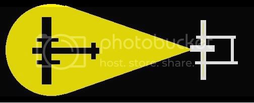
and ribbon sized:

What do you all think? Feel free to chime in or have a shot at it yourselves! And don't forget to sign up
here!
Michael
On the bench:
Sorta depends on your definition of "on the bench"...
British Columbia, Canada
Joined: September 03, 2009
KitMaker: 6,965 posts
AeroScale: 6,247 posts
Posted: Saturday, July 28, 2012 - 12:30 PM UTC
I took my inspiration from the Czech Air Force
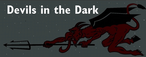
And ribbon sized. Perhaps it's a bit too dark?

When once you have tasted flight you will walk the Earth with your eyes turned skyward.
For there you have been, and there you will always long to return.
-Leonardo Da Vinci
England - North East, United Kingdom
Joined: October 20, 2005
KitMaker: 1,045 posts
AeroScale: 622 posts
Posted: Saturday, July 28, 2012 - 06:41 PM UTC
Michael that looks good at the size the ribbon will be.
Jessie I think it is slightly too dark to make out what it is on the smaller size ribbon is there anyway of making him lighter?
I think the pair of them are really good and I like both. As far as having a bash at designing/creating one I am thoroughly useless at things like that but I would have done something similar to what you both have already done
Angel by day, Devil by night
New York, United States
Joined: March 08, 2010
KitMaker: 3,662 posts
AeroScale: 174 posts
Posted: Sunday, July 29, 2012 - 12:14 AM UTC
I think both ribbons look really good but when Jessies get shank down to ribbon size you cat see much of it at all

Maybe Jessies should be the banner

Active Campaigns on the bench:
Operation Fall Gelb - Pz.Kpfw. IV Ausf. C
Engineering the Future - M-26 Recovery Vehicle
115 Campaigns completed
Wisconsin, United States
Joined: March 17, 2009
KitMaker: 156 posts
AeroScale: 153 posts
Posted: Sunday, July 29, 2012 - 03:20 AM UTC
Fantastic ribbon, Michael! Signing up now!
Regards,
Tom
On the workbench:
WNW 1/32 Fokker E.II for Canvas Falcons III
Trumpeter 1/32 MiG-21F-13 for 2nd Gen Jets Campaign
Texas, United States
Joined: January 30, 2006
KitMaker: 1,954 posts
AeroScale: 1,163 posts
Posted: Sunday, July 29, 2012 - 03:39 AM UTC
Here is my ribbon proposal.
it is based off of the Luftwaffe night fighter badge, which was similar to the day fighter badge but had brass oak leaf "wings" and a blackened circle/winged-arrow center (day fighter was silver/silver i think). German pilots were awarded this badge after 20 night fighter missions.
I stylized it a bit and left off the swastika so as to be somewhat less specific to German night fighters.

British Columbia, Canada
Joined: September 03, 2009
KitMaker: 6,965 posts
AeroScale: 6,247 posts
Posted: Sunday, July 29, 2012 - 03:41 AM UTC
Quoted Text
Jessie I think it is slightly too dark to make out what it is on the smaller size ribbon is there anyway of making him lighter?
Let's see what lighter overlays do.
Light

Medium

Dark

When once you have tasted flight you will walk the Earth with your eyes turned skyward.
For there you have been, and there you will always long to return.
-Leonardo Da Vinci
Texas, United States
Joined: January 30, 2006
KitMaker: 1,954 posts
AeroScale: 1,163 posts
Posted: Sunday, July 29, 2012 - 03:42 AM UTC
New York, United States
Joined: March 08, 2010
KitMaker: 3,662 posts
AeroScale: 174 posts
Posted: Sunday, July 29, 2012 - 03:54 AM UTC
Quoted Text
Here is my ribbon proposal.
it is based off of the Luftwaffe night fighter badge, which was similar to the day fighter badge but had brass oak leaf "wings" and a blackened circle/winged-arrow center (day fighter was silver/silver i think). German pilots were awarded this badge after 20 night fighter missions.
I stylized it a bit and left off the swastika so as to be somewhat less specific to German night fighters.

A ribbon design to look like 1 that was actually awarded would be cool

I like that 1 the best

Still think Jessies would make a good banner

Active Campaigns on the bench:
Operation Fall Gelb - Pz.Kpfw. IV Ausf. C
Engineering the Future - M-26 Recovery Vehicle
115 Campaigns completed
British Columbia, Canada
Joined: September 03, 2009
KitMaker: 6,965 posts
AeroScale: 6,247 posts
Posted: Sunday, July 29, 2012 - 03:54 AM UTC
The difference is very sublte; I varied the darkness of each overlay by about 10%. Perhaps it doesn't display well on your monitor. This tells me that other people may have the same problem.
Can you see the difference between these and the very dark one I used first?
When once you have tasted flight you will walk the Earth with your eyes turned skyward.
For there you have been, and there you will always long to return.
-Leonardo Da Vinci
Texas, United States
Joined: January 30, 2006
KitMaker: 1,954 posts
AeroScale: 1,163 posts
Posted: Sunday, July 29, 2012 - 05:01 AM UTC
Quoted Text
A ribbon design to look like 1 that was actually awarded would be cool  I like that 1 the best
while a nice idea, the restrictions and shape differences of the ribbon vs banner pretty much ensures that a design that looks good in one does not look very good in the other and vice versa
Texas, United States
Joined: January 30, 2006
KitMaker: 1,954 posts
AeroScale: 1,163 posts
Posted: Sunday, July 29, 2012 - 05:02 AM UTC
Quoted Text
Can you see the difference between these and the very dark one I used first?
yes
MichaelSatin
 Campaigns Administrator
Colorado, United States
Joined: January 19, 2008
KitMaker: 3,909 posts
AeroScale: 2,904 posts
Posted: Sunday, July 29, 2012 - 12:12 PM UTC
Jessica: That is very cool but hard to see as a ribbon. Perhaps if you lightened the devil and darkened the background (if possible)? It would make a great banner!
Vance: Great idea but maybe a bit too specific (German)?
I like the ideas everyone, keep 'em coming! 12 members so far, don't forget to sign in
here if you haven't yet.
Michael
On the bench:
Sorta depends on your definition of "on the bench"...
British Columbia, Canada
Joined: September 03, 2009
KitMaker: 6,965 posts
AeroScale: 6,247 posts
Posted: Sunday, July 29, 2012 - 12:16 PM UTC
Okay, that's good. Is Mr. Devil clearer for you? Easier to see?
When once you have tasted flight you will walk the Earth with your eyes turned skyward.
For there you have been, and there you will always long to return.
-Leonardo Da Vinci
Virginia, United States
Joined: July 06, 2012
KitMaker: 94 posts
AeroScale: 33 posts
Posted: Sunday, July 29, 2012 - 12:19 PM UTC
I'm interested, but I've got enough group build commitments to keep me busy. However, I'll follow with interest when you all get going.
The sound of squeaking track brings it all back
MichaelSatin
 Campaigns Administrator
Colorado, United States
Joined: January 19, 2008
KitMaker: 3,909 posts
AeroScale: 2,904 posts
Posted: Sunday, July 29, 2012 - 12:32 PM UTC
Quoted Text
Okay, that's good. Is Mr. Devil clearer for you? Easier to see?
Jessie,
Was there supposed to be a new picture here?
Michael
On the bench:
Sorta depends on your definition of "on the bench"...
British Columbia, Canada
Joined: September 03, 2009
KitMaker: 6,965 posts
AeroScale: 6,247 posts
Posted: Sunday, July 29, 2012 - 12:34 PM UTC
It's up the page a bit. I posted 3 slightly different samples.
When once you have tasted flight you will walk the Earth with your eyes turned skyward.
For there you have been, and there you will always long to return.
-Leonardo Da Vinci
 Now I see it is still on the shelves at the local craft store 35 years later and gets my attention all the time
  So count me in and I'll go run out and buy it tomorrow with a internet 25% off coupon tomorrow


 Now I see it is still on the shelves at the local craft store 35 years later and gets my attention all the time
  So count me in and I'll go run out and buy it tomorrow with a internet 25% off coupon tomorrow







 Maybe Jessies should be the banner



 I like that 1 the best


I like that 1 the best


