Hermon,
The biggest problem Grumman and Republic had here on the Island, and I'm sure the rest of the defense industry, is that most of their male work force went into service, and the assembly lines were filled with Women or men with no experience in aircraft assembly. They were taught one job, and that's all they did. My Mother in Law was one of the "Rosie the Riveters" at Grumman's during the war, and she did the same job everyday until they changed production for a different aircraft. So whatever changes they made, it was simple and straight forward as they could get it.
Joel
World War II
Discuss WWII and the era directly before and after the war from 1935-1949.
Discuss WWII and the era directly before and after the war from 1935-1949.
Hosted by Rowan Baylis
FM-2 Conversion for Tamiya F4F Wildcat
Joel_W

Joined: December 04, 2010
KitMaker: 11,666 posts
AeroScale: 7,410 posts

Posted: Thursday, January 01, 2015 - 02:38 AM UTC
Thearmorer

Joined: June 17, 2014
KitMaker: 121 posts
AeroScale: 118 posts

Posted: Thursday, January 01, 2015 - 04:07 AM UTC
Hermon,
No southern accent yet, I just moved to the Asheville, NC area a few months ago from the Great Northeast Kleptocracy (upstate NY) where the USAF dumped me back in '89. It took me this long to get my ducks lined up.
Joel,
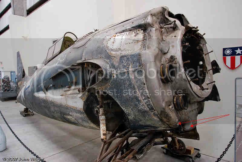
I checked some of the references I've got and they indicate the overall length of the Wildcat didn't change after the F4F-3. This photo may help explain the missing space.
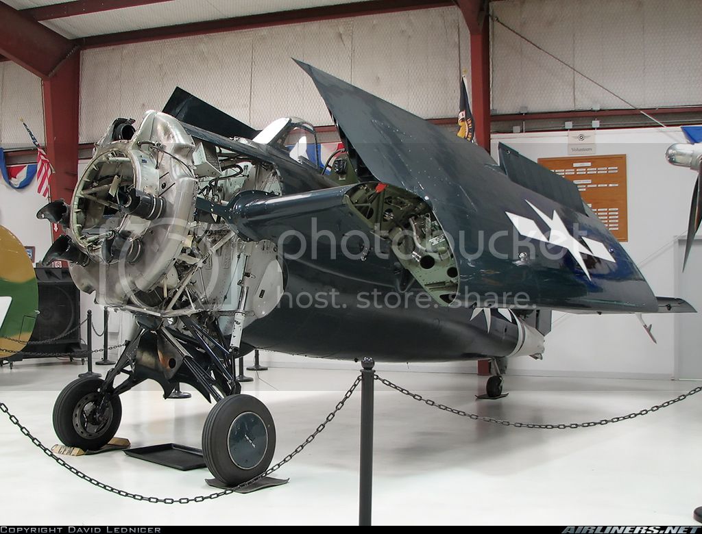
That ring mounts the engine and the corresponding space is used by the new exhaust stack arrangement of the R-1820. Plus it's kind of a cool picture of the part of the aircraft.
Duane
No southern accent yet, I just moved to the Asheville, NC area a few months ago from the Great Northeast Kleptocracy (upstate NY) where the USAF dumped me back in '89. It took me this long to get my ducks lined up.
Joel,
I checked some of the references I've got and they indicate the overall length of the Wildcat didn't change after the F4F-3. This photo may help explain the missing space.

That ring mounts the engine and the corresponding space is used by the new exhaust stack arrangement of the R-1820. Plus it's kind of a cool picture of the part of the aircraft.
Duane
raypalmer

Joined: March 29, 2010
KitMaker: 1,151 posts
AeroScale: 985 posts

Posted: Thursday, January 01, 2015 - 04:19 AM UTC
This is a brilliant thread. Uncommonly concise writeups Miller. I will be watching this!

VonCuda

Joined: November 28, 2005
KitMaker: 2,216 posts
AeroScale: 1,080 posts

Posted: Thursday, January 01, 2015 - 06:40 AM UTC
Well it's a small world DMiller. I live in Asheville, N.C. as well. About 10 minutes outside of Asheville in little old Leicester (pronounced Lester). 
Anyway, I like your style and am enjoying your build. Really nice work going on there man.

Anyway, I like your style and am enjoying your build. Really nice work going on there man.

Joel_W

Joined: December 04, 2010
KitMaker: 11,666 posts
AeroScale: 7,410 posts

Posted: Thursday, January 01, 2015 - 07:38 PM UTC
Duane,
Thanks for the info and the picture. I saved it for a future build.
I'm trying to convince my lovely wife that when I fully retire (semi retired now), that we should move to NC form Long Island, New York. Certainly would be a lot cheaper, and a lot nicer. Besides, I could Bass fish nearly all year long.
Joel
Thearmorer

Joined: June 17, 2014
KitMaker: 121 posts
AeroScale: 118 posts

Posted: Sunday, January 04, 2015 - 06:41 AM UTC
This is the point in the build where it is time to seriously sling some paint. Having gotten the primer and blemishes where I was satisfied it was time to think about the paint scheme. I decided to pre-shade this one since it will have the monochromatic late-war USN glossy sea blue scheme. This is a new trick for this old dog, but I've seen it used to good effect by others, so figured I'd give it a try. I'm generally not an overly enthusiastic fan of hard weathering unless it's really called for. Example:
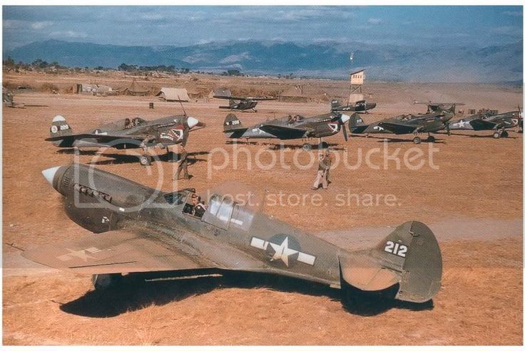
This is a shot of a P-40N of the 25th Fighter Sqdn. 51st Fighter Gp. in China late '43 or early '44. This was the unit my father was in during the war and I have several photos to flesh this out, so it will probably be the subject of a future build. As a former C-130 crewchief, I'm surprised this thing even flew with all that dirt. This is definitely NOT what you will see in this build.
With an overall blue color scheme I figured if the pre-shading stood out it would break up the monochrome effect, and if as I suspected it got lost under all the dark blue, these were pretty clean airplanes anyway. Sitting there on the bare primer the effect looks similar to a genetically defective zebra viewed while on mood altering drugs. I like to have the airbrush moving before I press the trigger to avoid nasty blobs of paint at the start point, so as a result I'm never 100% sure where exactly the paint and plane will meet. This is a good example of that.
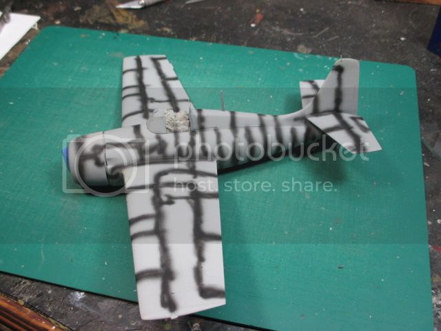
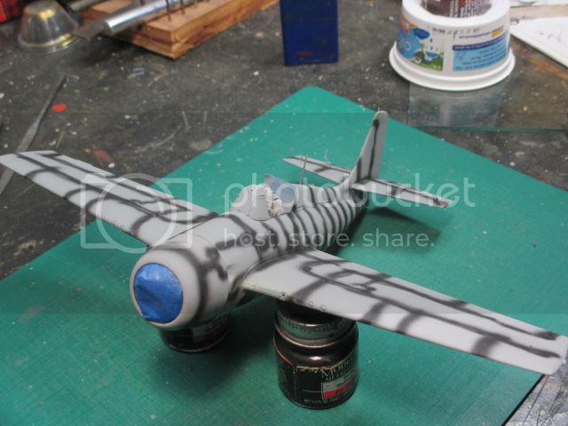
The lines were so wobbly that I contemplated cutting a slot in a 3x5 card to use as a guide, but rejected that idea for fear that that would make the lines too regular and not diffuse enough on the edges. The only way to find out was to load up the sea blue and shoot away. A review of my existing paint stash revealed that all I had on hand was non-specular sea blue, not glossy sea blue, but a quick check of the paint chips in Elliott's "Monogram US Navy Color Guide" revealed that the only difference is the sheen. A coat of Pledge (Future) floor wax would take care of that angle. I broke out my trusty bottle of Floquil, a little lacquer thinner and let fly. With a mono-color scheme I could start on the bottom to make sure everything was working as advertised. The only minor snag was my trusty moisture trap did not trap all it should have and I got a couple of blurps of moisture mixed in, but once dry a quick re-shot took care of that issue. The next day (after a more judicious use of the de-humidifier) the topside went without a hitch.
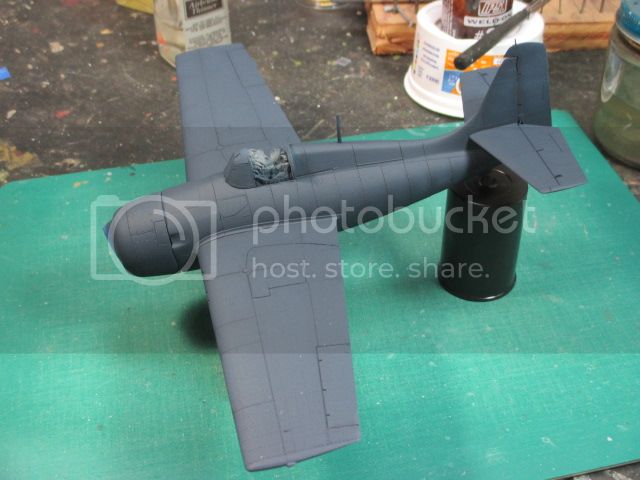
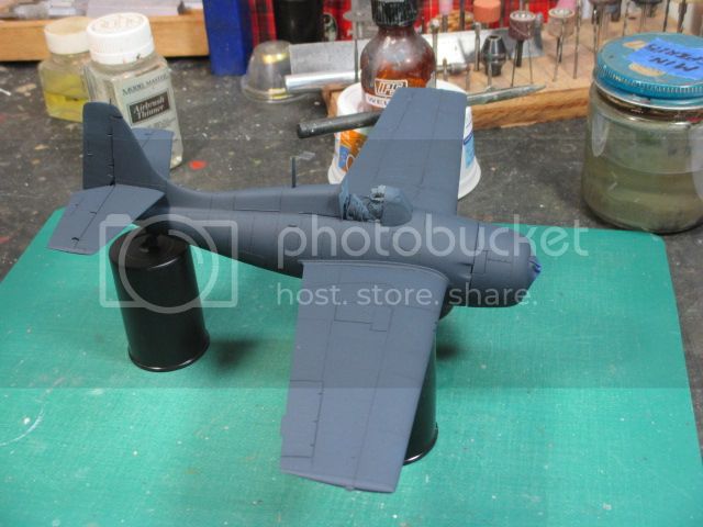
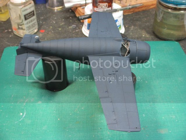
You'll note, that if you look close, and are looking for it, you can barely see the pre-shading lines at this point. We'll see what the final result looks like after all the post-weathering is done. One thing I was pleased to see was that after the re-scribing work on the major panel lines, not that much detail damage was done to the wings after the removal of the outer .50 cal. wing panels. Now that we're talking about colors, I suspect that most of you out there are probably seeing something that has a definite gray tinge to it. This is probably an artifact of the lighting in the "Dungeon", the actual paint is definitely dark blue. This will be a little more evident after the application of the floor wax gloss coat.
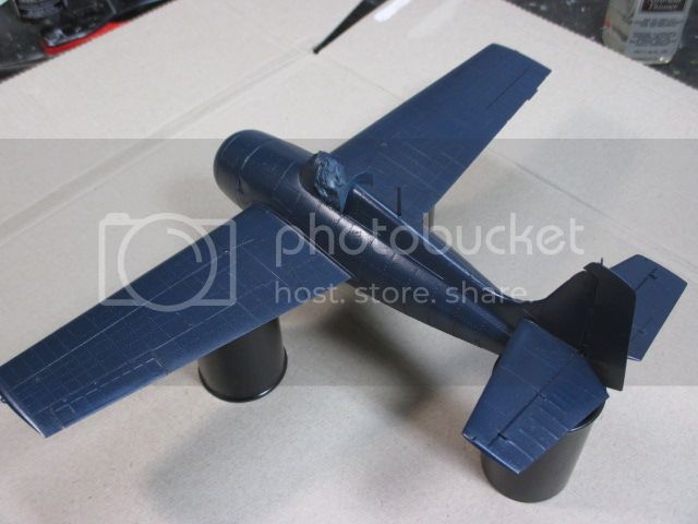
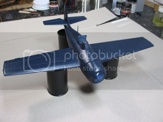
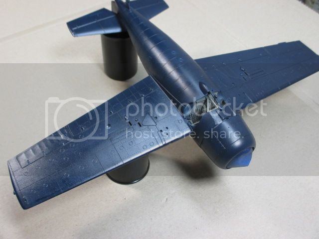
To highlight this further, I took a couple of pictures outside under natural light. The conditions were partly sunny with the same cardboard background.
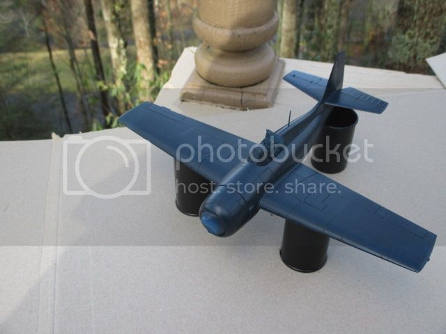
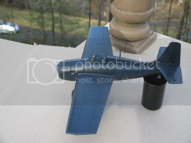
At least on my monitor the color outside is a little less deep blue, with the dungeon shots being the closest to the actual color chips. Another reason to not obsess over the color thing.
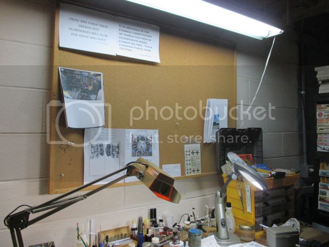
This crime scene photo shows where most of this folly is hatched, specifically it shows the lighting situation. The overhead light is standard get-em-at-the-building supply place florescent, the flex lamp on the left is a small florescent with a tendency towards yellow, and on the right is a "full spectrum" bulb I use to at least attempt a little fidelity in my color evaluation, but it's mostly guesswork most of the time. A final note on the floor wax treatment, I've used this (Future/Pledge) for a long time, it's considerably cheaper than buying miniscule bottles of micro-gloss or some similar thing, it responds well to setting solutions and the surface tension of this stuff is astounding. For all intents and purposes it's self-leveling. This application was airbrushed on, but in the past I've applied it with a paint brush and gotten very good results. Doing it that way you do have to watch for puddling, but keep the edge of a paper towel handy to soak up any overage and your good to go. You folks who are eyeing that hairy-stick campaign might want to keep this in mind. Take a cue from "Fester-the-Flasher"; a good glossy overcoat hides a multitude of sins.

This is a shot of a P-40N of the 25th Fighter Sqdn. 51st Fighter Gp. in China late '43 or early '44. This was the unit my father was in during the war and I have several photos to flesh this out, so it will probably be the subject of a future build. As a former C-130 crewchief, I'm surprised this thing even flew with all that dirt. This is definitely NOT what you will see in this build.
With an overall blue color scheme I figured if the pre-shading stood out it would break up the monochrome effect, and if as I suspected it got lost under all the dark blue, these were pretty clean airplanes anyway. Sitting there on the bare primer the effect looks similar to a genetically defective zebra viewed while on mood altering drugs. I like to have the airbrush moving before I press the trigger to avoid nasty blobs of paint at the start point, so as a result I'm never 100% sure where exactly the paint and plane will meet. This is a good example of that.


The lines were so wobbly that I contemplated cutting a slot in a 3x5 card to use as a guide, but rejected that idea for fear that that would make the lines too regular and not diffuse enough on the edges. The only way to find out was to load up the sea blue and shoot away. A review of my existing paint stash revealed that all I had on hand was non-specular sea blue, not glossy sea blue, but a quick check of the paint chips in Elliott's "Monogram US Navy Color Guide" revealed that the only difference is the sheen. A coat of Pledge (Future) floor wax would take care of that angle. I broke out my trusty bottle of Floquil, a little lacquer thinner and let fly. With a mono-color scheme I could start on the bottom to make sure everything was working as advertised. The only minor snag was my trusty moisture trap did not trap all it should have and I got a couple of blurps of moisture mixed in, but once dry a quick re-shot took care of that issue. The next day (after a more judicious use of the de-humidifier) the topside went without a hitch.


You'll note, that if you look close, and are looking for it, you can barely see the pre-shading lines at this point. We'll see what the final result looks like after all the post-weathering is done. One thing I was pleased to see was that after the re-scribing work on the major panel lines, not that much detail damage was done to the wings after the removal of the outer .50 cal. wing panels. Now that we're talking about colors, I suspect that most of you out there are probably seeing something that has a definite gray tinge to it. This is probably an artifact of the lighting in the "Dungeon", the actual paint is definitely dark blue. This will be a little more evident after the application of the floor wax gloss coat.


To highlight this further, I took a couple of pictures outside under natural light. The conditions were partly sunny with the same cardboard background.


At least on my monitor the color outside is a little less deep blue, with the dungeon shots being the closest to the actual color chips. Another reason to not obsess over the color thing.

This crime scene photo shows where most of this folly is hatched, specifically it shows the lighting situation. The overhead light is standard get-em-at-the-building supply place florescent, the flex lamp on the left is a small florescent with a tendency towards yellow, and on the right is a "full spectrum" bulb I use to at least attempt a little fidelity in my color evaluation, but it's mostly guesswork most of the time. A final note on the floor wax treatment, I've used this (Future/Pledge) for a long time, it's considerably cheaper than buying miniscule bottles of micro-gloss or some similar thing, it responds well to setting solutions and the surface tension of this stuff is astounding. For all intents and purposes it's self-leveling. This application was airbrushed on, but in the past I've applied it with a paint brush and gotten very good results. Doing it that way you do have to watch for puddling, but keep the edge of a paper towel handy to soak up any overage and your good to go. You folks who are eyeing that hairy-stick campaign might want to keep this in mind. Take a cue from "Fester-the-Flasher"; a good glossy overcoat hides a multitude of sins.
Posted: Sunday, January 04, 2015 - 07:13 AM UTC
Fabulous build so far, and I love that photo of the real FM-2 engine mount. A real keeper. Your initial idea with the clear plastic wasn't far off!
Clean workspace too, unlike my pigpen.
Clean workspace too, unlike my pigpen.
Thearmorer

Joined: June 17, 2014
KitMaker: 121 posts
AeroScale: 118 posts

Posted: Sunday, January 04, 2015 - 07:45 AM UTC
Brian,
Don't let the workspace fool you, truth be known, the only reason it's this clean is the necessity of clearing enough space to take the photos.
Don't let the workspace fool you, truth be known, the only reason it's this clean is the necessity of clearing enough space to take the photos.
Joel_W

Joined: December 04, 2010
KitMaker: 11,666 posts
AeroScale: 7,410 posts

Posted: Sunday, January 04, 2015 - 08:03 AM UTC
Duane,
The Semi-gloss Sea Blue inside pictures seem to be the closest to ANA 606 Semi-Gloss Sea Blue. As you noted, it's the same color as ANA 607 Non-Specular Sea Blue, just it's semi glossy brother. The two outside pictures taken under the same lighting conditions are different in tonality, while the two in door pictures are very similar.
The interpretation of White Balance by your digital camera creates those differences. The use of the gray cardboard, while lighter then a standard #18 gray card, helps your cameras processor get closer to the actual color.
It's been my general feeling that pre-shading under dark colors usually just gets lost after a few coats, and isn't worth the effort, so I prefer post shading and weathering techniques.
With the basic painting complete, the resin conversion is impossible to detect, a job very well done.
Joel
Thearmorer

Joined: June 17, 2014
KitMaker: 121 posts
AeroScale: 118 posts

Posted: Sunday, January 04, 2015 - 07:25 PM UTC
Now with the major painting done it's time to consider the markings. This is the selection:
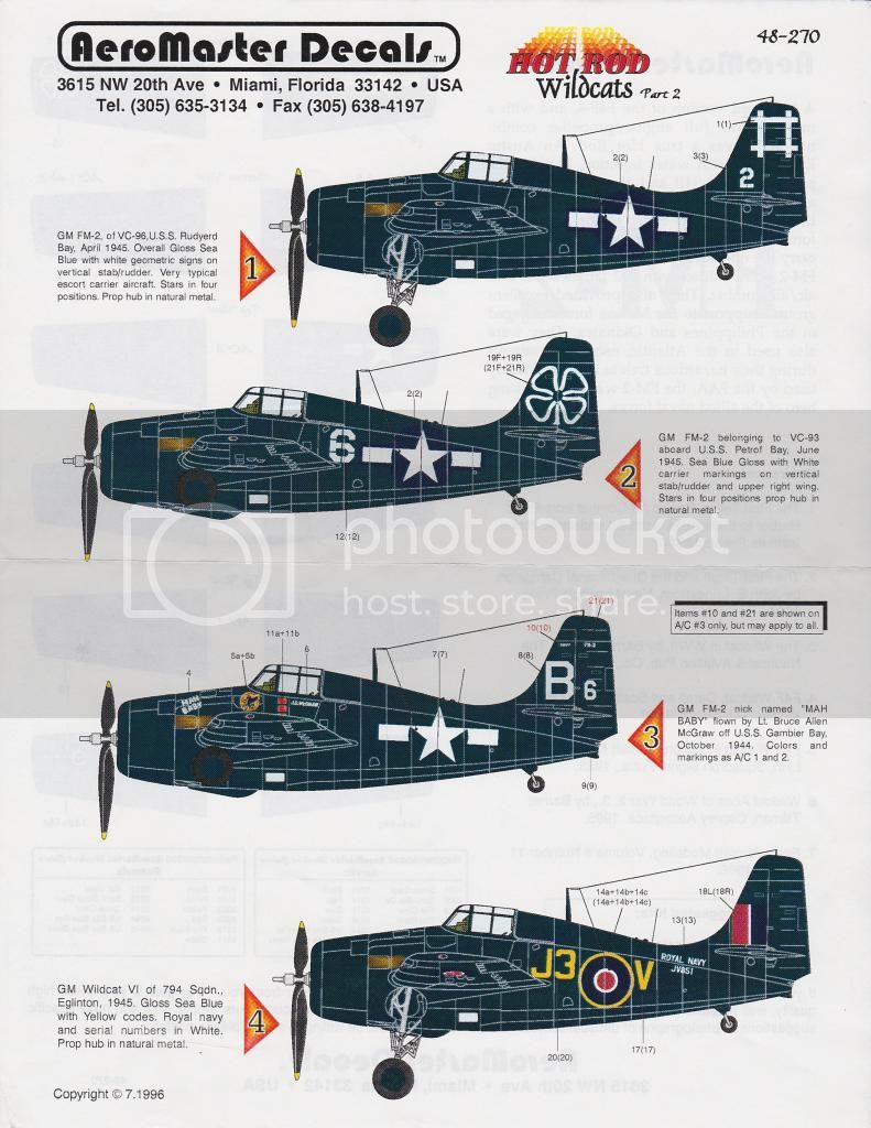
I decided to go with number 2, the VC-93 bird aboard the USS Petrof Bay. This decision was based largely on the location of the unit markings. My finish on the vertical extension of the tail turned out well, but it's not flawless. I'm thinking the clover leaf will break up the expanse of blue and make any imperfections less noticeable. The same theory is in effect on the top of the right wing. This was the only option that had the ship marking on the wing as well as the tail. I've had this sheet for awhile now so the only remaining concern is if it's still good. It's not ancient and has been in the original ziploc bag the entire time so I'm somewhat confident it'll work. Next post will tell.

I decided to go with number 2, the VC-93 bird aboard the USS Petrof Bay. This decision was based largely on the location of the unit markings. My finish on the vertical extension of the tail turned out well, but it's not flawless. I'm thinking the clover leaf will break up the expanse of blue and make any imperfections less noticeable. The same theory is in effect on the top of the right wing. This was the only option that had the ship marking on the wing as well as the tail. I've had this sheet for awhile now so the only remaining concern is if it's still good. It's not ancient and has been in the original ziploc bag the entire time so I'm somewhat confident it'll work. Next post will tell.
Posted: Sunday, January 04, 2015 - 08:02 PM UTC
I would probably go with 3, but I agree that the right wing shamrock will make 2 look very cool. In my experience Aeromaster decals do stand the test of time. Shouldn't be a problem.
Are you going to demarcate somehow a "non-specular sea blue" anti-glare paint panel forward of the cockpit? Supposedly they did that on the real thing, though I think it will be almost impossible to see even if you do so using flat coat vs. gloss on that section of the fuselage. I can send a little technical info on this if you want/need it.
Are you going to demarcate somehow a "non-specular sea blue" anti-glare paint panel forward of the cockpit? Supposedly they did that on the real thing, though I think it will be almost impossible to see even if you do so using flat coat vs. gloss on that section of the fuselage. I can send a little technical info on this if you want/need it.
Joel_W

Joined: December 04, 2010
KitMaker: 11,666 posts
AeroScale: 7,410 posts

Posted: Sunday, January 04, 2015 - 08:31 PM UTC
Duane,
I also prefer #3 as the B6 and data on the tail will offer the same effect as the Shamrock, as well as some much needed color for the cowl area.
I was under the assumption that the anti glare panel on the top of the cowl was flat black, not just matt Non-Spectacular Blue. It's certainly a interesting question, just not sure where one would find the answer.
Joel
Posted: Sunday, January 04, 2015 - 08:55 PM UTC
Quoted Text
Duane,
I also prefer #3 as the B6 and data on the tail will offer the same effect as the Shamrock, as well as some much needed color for the cowl area.
I was under the assumption that the anti glare panel on the top of the cowl was flat black, not just matt Non-Spectacular Blue. It's certainly a interesting question, just not sure where one would find the answer.
Joel
I'll post what I have on this later today.
Thearmorer

Joined: June 17, 2014
KitMaker: 121 posts
AeroScale: 118 posts

Posted: Sunday, January 04, 2015 - 11:51 PM UTC
Brian & Joel,
Greatly appreciate the input as always. I hadn't put a lot of thought into the anti-glare panel issue til now, so I went back and double checked what sources I've got. I've got several books with original color photos from the period and some specific to Navy colors and markings. I couldn't find any good evidence of anti-glare panels during the war. The Grumman cats in particular seemed to have very little reflective difference between the top and sides of the aircraft. The most noticeable were the Corsairs, but even that could have been attributed to sun bleaching and engine heat on the cowling. My leading ploy at this point is going to be a dusting of dull-coat over the top to tone things down some. I did give number 3 markings a lot of consideration but decided against it because of the aforementioned reasons and the unit (personal?) emblem and kill markings are two piece affairs and not being sure of the decal condition decided I didn't want to mess with it. There is also the fact that those markings are on the the left side only which leaves the opposite completely blank. My weathering plan is heavy on the forward end of the aircraft anyway, there's the characteristic FM-2 exhaust streaking and most of the rest of the grunge will be associated with the cowling and adjacent areas. I will loose some color granted, but I do get to spread the white around more.
Duane
Posted: Monday, January 05, 2015 - 12:08 AM UTC
I will scan and post my source a bit later today.
As to the scheme, "Hey, it's your model!"
As to the scheme, "Hey, it's your model!"

Thearmorer

Joined: June 17, 2014
KitMaker: 121 posts
AeroScale: 118 posts

Posted: Thursday, January 15, 2015 - 06:47 AM UTC
I finally got some decals slathered on the Franken-Grumman and it's now starting to actually look like an FM-2. The AeroMaster decals I used behaved pretty well in spite of sitting around who-knows-where for several years. A very small piece of the underwing insignia did chip out, but a quick dab of white paint took care of that in short order. The only real problem area was the rather large national insignia on the fuselage. There are a lot of curved surfaces to deal with, and a rather odd shape with the roundel and bars. This was compounded slightly by having some rather pronounced rivets in the same area. My preferred decal solution is micro-set/sol and for the most part AeroMaster decals respond well to it. It took about two repeat applications of micro-sol along with some pin pricks and Q-tip action to get both sides to play nice. In retrospect I would take a couple of swipes with some 600 or 1000 grit wet & dry sandpaper to the fuselage to mellow out the rivet detail slightly. While the rivets aren't overly done on this kit, your going to have to do some scrubbing along the fuselage spine anyway to remove the seam, so it would reduce the contrast in any event, and make those decals lay a little easier. The rest of the decals went down without any issues, silvering or otherwise.
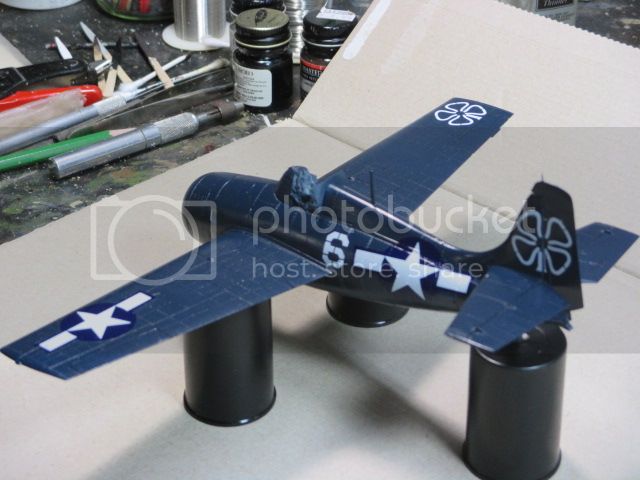

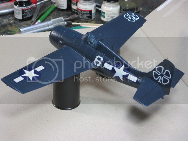
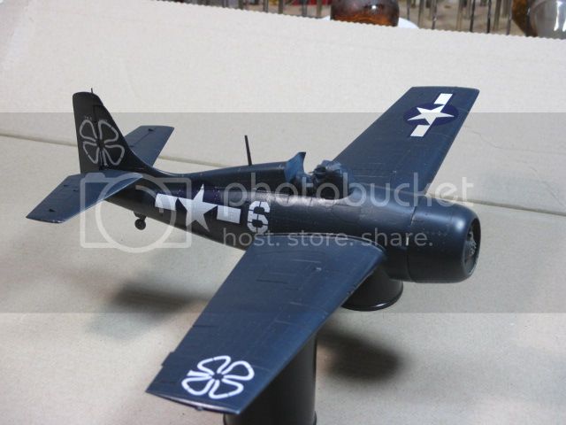
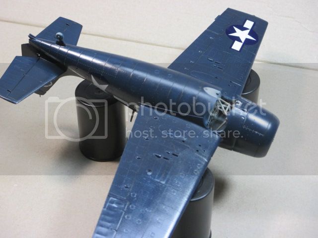
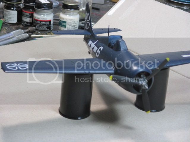
It's hard to tell with the lighting I used, but some preliminary weathering has been applied. I use a burnt umber/black mix as a wash around the cowling and a little on the front fuselage. I went with a flat black wash along the flight control seams to try and enhance the impression these are separate pieces. I applied the same along the wing fold seam. This is going to be a tough call on the degree of darkening. Viewed from some angles it looks like enough, viewed from others it's almost unnoticeable. The next step will be with pastel chalks so I'll wait and see what the big picture looks like at that point. The next shot is the engine fixed in place and the prop stuck on. I think it's a keeper.
This one's for Brian and Joel, I stumbled across the KMC instruction sheet (it was in a defunct Fujimi Bf110D box, go figure?) and their solution with the engine spacing issue was to slide the engine into the cowling until the engine front lined up with the cowling ring and put white glue to hold it in place, then fix it with epoxy. Crude but effective I guess, although I like my method better.
This next shot is not a promo for the Rainbow Coalition, so do not panic dear readers. I'm finally down to the point where I am contemplating how to handle navigation and formation light lenses. On the real aircraft the colored lenses aren't all that prominent when the light are off. So, how to represent that in scale.
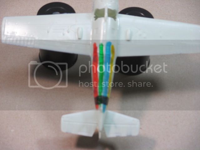
What I've done here with my trusty aircraft dummy is testing some of the Tamiya clear paints against several likely backgrounds. I used (from top to bottom) Gunze silver; Floquil old silver; Tester gloss white; Model Master FS36622 gray; Tamiya Aluminum and finally Gunze brunt metal (just for something dark). For photography purposes I probably should have used a darker background for the swatches, but the color intersections did shed a little light on the situation. As expected the white gives the most intense colors, not what I was looking for. Surprisingly to me was how much darker the FS36622 was from the white (not gloss is part of it) since it is what I use as an undercoat for large areas (like fuselage undersides) that are white on the real aircraft. At scale the white reflects so much light that it washes everything out, I suspect this is why undershading works so well in this area. Various silvers is what I've used in the past for undercoating lights and I was interested in seeing how much difference there was between paints. Naturally no one shade of paint worked the best under all of the colors. Of the colors selected, I thought the Floquil old silver was the best compromise. I may go back and try some of the Model Master "Airbrush Only" metallics which have a wider range of hue and see if that yields any results. If anyone out there has a good (or even middling) handle on this I'd appreciate some input.


It's hard to tell with the lighting I used, but some preliminary weathering has been applied. I use a burnt umber/black mix as a wash around the cowling and a little on the front fuselage. I went with a flat black wash along the flight control seams to try and enhance the impression these are separate pieces. I applied the same along the wing fold seam. This is going to be a tough call on the degree of darkening. Viewed from some angles it looks like enough, viewed from others it's almost unnoticeable. The next step will be with pastel chalks so I'll wait and see what the big picture looks like at that point. The next shot is the engine fixed in place and the prop stuck on. I think it's a keeper.

This one's for Brian and Joel, I stumbled across the KMC instruction sheet (it was in a defunct Fujimi Bf110D box, go figure?) and their solution with the engine spacing issue was to slide the engine into the cowling until the engine front lined up with the cowling ring and put white glue to hold it in place, then fix it with epoxy. Crude but effective I guess, although I like my method better.
This next shot is not a promo for the Rainbow Coalition, so do not panic dear readers. I'm finally down to the point where I am contemplating how to handle navigation and formation light lenses. On the real aircraft the colored lenses aren't all that prominent when the light are off. So, how to represent that in scale.

What I've done here with my trusty aircraft dummy is testing some of the Tamiya clear paints against several likely backgrounds. I used (from top to bottom) Gunze silver; Floquil old silver; Tester gloss white; Model Master FS36622 gray; Tamiya Aluminum and finally Gunze brunt metal (just for something dark). For photography purposes I probably should have used a darker background for the swatches, but the color intersections did shed a little light on the situation. As expected the white gives the most intense colors, not what I was looking for. Surprisingly to me was how much darker the FS36622 was from the white (not gloss is part of it) since it is what I use as an undercoat for large areas (like fuselage undersides) that are white on the real aircraft. At scale the white reflects so much light that it washes everything out, I suspect this is why undershading works so well in this area. Various silvers is what I've used in the past for undercoating lights and I was interested in seeing how much difference there was between paints. Naturally no one shade of paint worked the best under all of the colors. Of the colors selected, I thought the Floquil old silver was the best compromise. I may go back and try some of the Model Master "Airbrush Only" metallics which have a wider range of hue and see if that yields any results. If anyone out there has a good (or even middling) handle on this I'd appreciate some input.
raypalmer

Joined: March 29, 2010
KitMaker: 1,151 posts
AeroScale: 985 posts

Posted: Thursday, January 15, 2015 - 07:04 AM UTC
Quoted Text
I actually do but we're too late. I paint the inside of the clear part (if there is one) with tamiya clear colour unthinned. Then make a crude dome over it with tin tape. Mask it with microscale liquid mask and be prepared for a touch up when you peel that off.
. At scale the white reflects so much light that it washes everything out, I suspect this is why undershading works so well in this area. Various silvers is what I've used in the past for undercoating lights and I was interested in seeing how much diffe. If anyone out there has a good (or even middling) handle on this I'd appreciate some input.
Alternatively if there is no clear part... I use gloss white, or gloss grey (how dark depends on what looks rght) to depict the lens, and then a single liberal daub of unthinned tamiya clear colour over it. Obviously the white for really prominent looking lights and grey for more subdued.
Posted: Thursday, January 15, 2015 - 07:41 AM UTC
Hi, I meant to get back to you on the cowling anti glare panel. My day job intervened.
My source is the Monogram USN & MC A/C Color Guide, Vol 2, 1940 - 1949. There was a spec dealing with this. For a short time the regs said everything glossy sea blue, but then there was an amendment issued that basically said to paint non-specular sea blue those sections of the A/C where glossy color could interfere with the pilot's vision. It was pretty vague!
I think what I would do is simply flat-coat the cowling and fuselage in front of the windscreen maybe 25% of the circumference of the cowling so that there is a barely discernible but definite contrast between the glossy and non-specular sea blue sections on the top. I myself wouldn't drag out different paint to do it: too lazy for such a small difference.
It's coming along VERY nicely, BTW.
My source
 is the Monogram USN & MC A/C Color Guide, Vol 2, 1940 - 1949. There was a spec dealing with this. For a short time the regs said everything glossy sea blue, but then there was an amendment issued that basically said to paint non-specular sea blue those sections of the A/C where glossy color could interfere with the pilot's vision. It was pretty vague!
I think what I would do is simply flat-coat the cowling and fuselage in front of the windscreen maybe 25% of the circumference of the cowling so that there is a barely discernible but definite contrast between the glossy and non-specular sea blue sections on the top. I myself wouldn't drag out different paint to do it: too lazy for such a small difference.
It's coming along VERY nicely, BTW.
Posted: Thursday, January 15, 2015 - 04:48 PM UTC
I did some internet searching and found this pic of your aircraft:
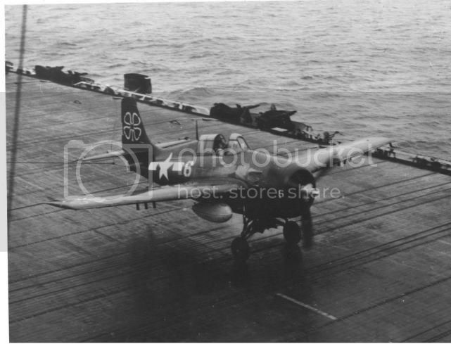
I saw a number of others from that squadron, VC-93, but this was the only one with the shamrock on the right wing. Note small "6" on cowling sides too. Reminds me of a nickname for "AeroMaster" decals: "ErrorMaster." (Bawhawhaw!)
Note prominent missile stubs on bottom wings. I would be sorely tempted to add missiles to this bird for the sake of variety: "It's a real FM-2." But, not without pictures showing their placement on the stubs and how far they protruded ahead of the wing.
The drop tanks are interesting. Hard to say what shade grey they are. I wonder if they are natural metal? Also note what appears to be a large red filler cap on top of the tank, forward.
Note also heavy engine exhaust stains. Looking at the photo, I think the engine exhaust plate has the scalloped lines we see in the below picture.
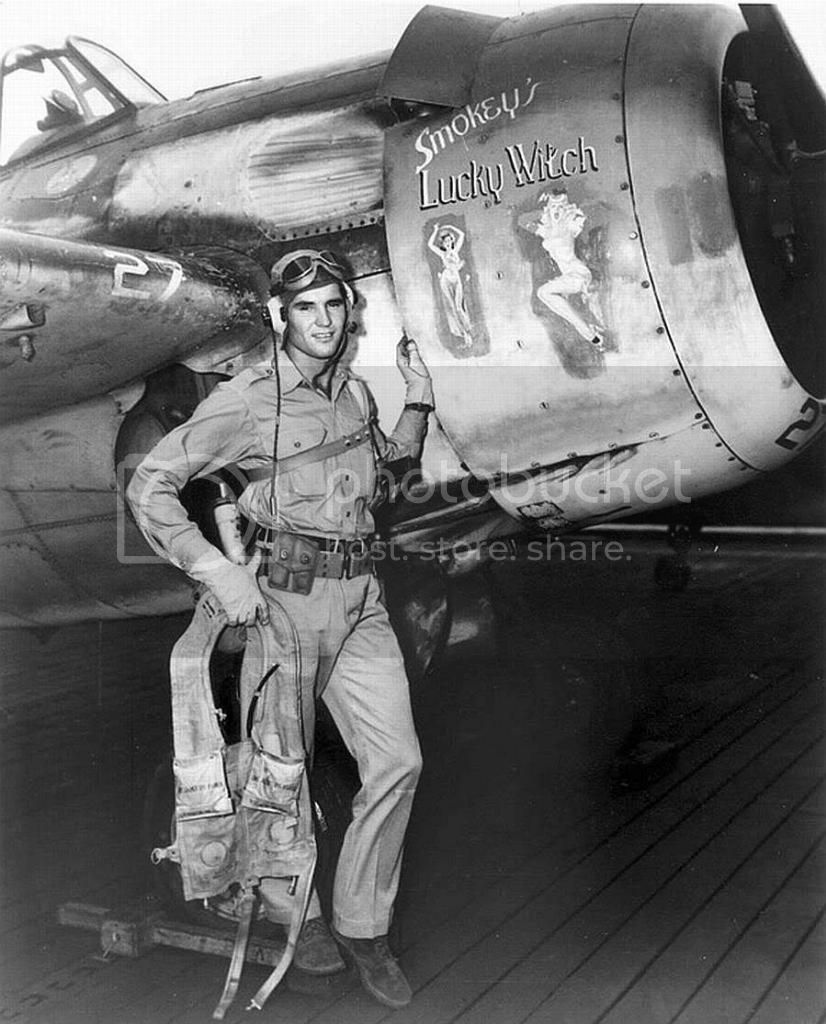
If it was me. I'd lightly scribe them in with a #11 blade and then add those prominent rivet marks around the border. That might be a job for Mike Grant's rivet decals, but not sure.
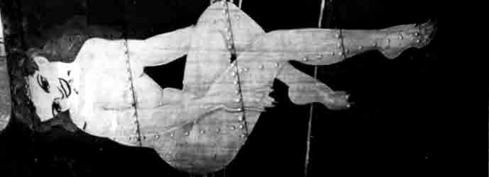
Interesting to see how tremendously worn the second A/C is. Rare to see pin-ups like that on USN A/C too.
As to what to do about the formation lights, for the green, amber, red trio on the belly on my F4F-3 I punched out three circles of thin aluminum foil and glued them over the places where the lenses were with a light "Schmear" (think Jewish deli/cream cheese) of thinned white glue underneath. It fit the contour nicely: no raised effect. Then I applied the Tamiya clear paints. While I agree they weren't prominent unless lit, without real color they might get completely lost. Anyway, it worked for me.
What do the say in the Nav: "Carry on"?

I saw a number of others from that squadron, VC-93, but this was the only one with the shamrock on the right wing. Note small "6" on cowling sides too. Reminds me of a nickname for "AeroMaster" decals: "ErrorMaster." (Bawhawhaw!)
Note prominent missile stubs on bottom wings. I would be sorely tempted to add missiles to this bird for the sake of variety: "It's a real FM-2." But, not without pictures showing their placement on the stubs and how far they protruded ahead of the wing.
The drop tanks are interesting. Hard to say what shade grey they are. I wonder if they are natural metal? Also note what appears to be a large red filler cap on top of the tank, forward.
Note also heavy engine exhaust stains. Looking at the photo, I think the engine exhaust plate has the scalloped lines we see in the below picture.

If it was me. I'd lightly scribe them in with a #11 blade and then add those prominent rivet marks around the border. That might be a job for Mike Grant's rivet decals, but not sure.
Interesting to see how tremendously worn the second A/C is. Rare to see pin-ups like that on USN A/C too.
As to what to do about the formation lights, for the green, amber, red trio on the belly on my F4F-3 I punched out three circles of thin aluminum foil and glued them over the places where the lenses were with a light "Schmear" (think Jewish deli/cream cheese) of thinned white glue underneath. It fit the contour nicely: no raised effect. Then I applied the Tamiya clear paints. While I agree they weren't prominent unless lit, without real color they might get completely lost. Anyway, it worked for me.
What do the say in the Nav: "Carry on"?
Posted: Thursday, January 15, 2015 - 06:01 PM UTC
Quoted Text
Looking at the photo, I think the engine exhaust plate has the scalloped lines we see in the below picture.
* * *
If it was me. I'd lightly scribe them in with a #11 blade and then add those prominent rivet marks around the border. That might be a job for Mike Grant's rivet decals, but not sure.
Hummm. In the second picture about even with the pilot's belt forward is what appears too be a second engine exhaust indentation in the fuselage just behind the cowling. No? There's no question there's engine exhaust stain there IMHO. In your build it looks like you've sanded out something like an indentation in this area. I would probably add a really thin styrene strip to represent the border and punch rivets in it, then really dirty the whole thing up.
If this is what I think it is, then it is the very first time I have ever noticed a lower engine exhaust on an FM-2. What a shock!
Posted: Friday, January 16, 2015 - 12:43 AM UTC
Here's an online pic showing placement of the missile stubs.
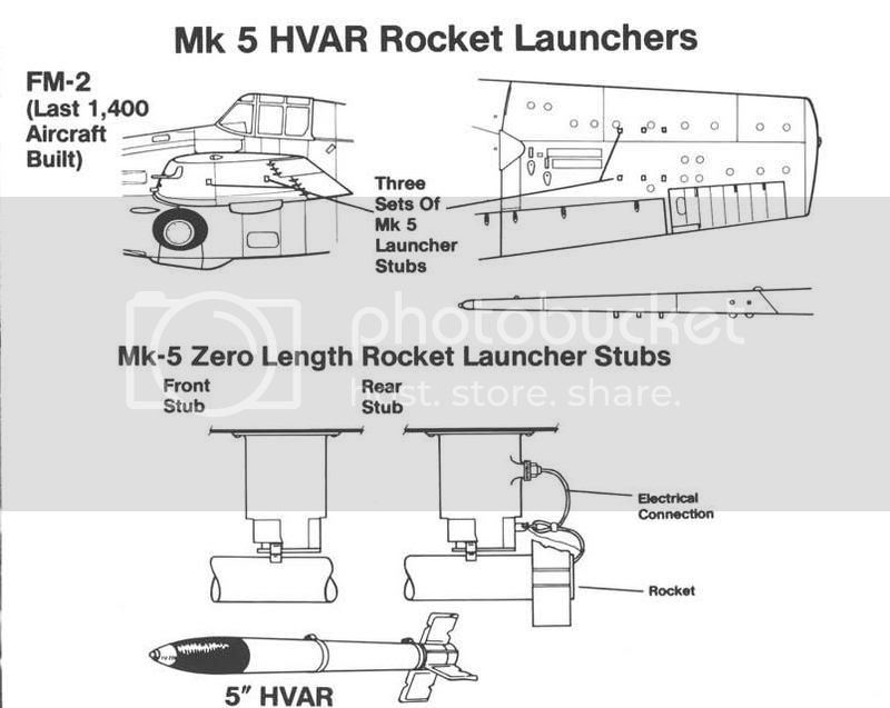
Also, on reflection, I bet the lower engine exhausts apertures on the FM-2 are basically what was present as the bottom engine exhaust apertures for the P&W powered versions of the airframe.

Also, on reflection, I bet the lower engine exhausts apertures on the FM-2 are basically what was present as the bottom engine exhaust apertures for the P&W powered versions of the airframe.
Joel_W

Joined: December 04, 2010
KitMaker: 11,666 posts
AeroScale: 7,410 posts

Posted: Friday, January 16, 2015 - 02:32 AM UTC
I'm still trying to come to terms with the concept that there isn't a proper anti glare panel, but between Brian's research, and looking at those pictures, it sure doesn't seem that there is one. I'd go with the approach of just Dull coating the top of the fuselage to the cowl ring.
As for a 2nds engine exhaust towards the bottom of the cowl, the staining looks much darker then the light gray carbon stains. I really have no idea what it may be, but I'm not convinced that treating it as a exhaust without proper documentation is the right way to go.
Joel
As for a 2nds engine exhaust towards the bottom of the cowl, the staining looks much darker then the light gray carbon stains. I really have no idea what it may be, but I'm not convinced that treating it as a exhaust without proper documentation is the right way to go.
Joel
Posted: Friday, January 16, 2015 - 03:04 AM UTC
Quoted Text
I'm still trying to come to terms with the concept that there isn't a proper anti glare panel, but between Brian's research, and looking at those pictures, it sure doesn't seem that there is one. I'd go with the approach of just Dull coating the top of the fuselage to the cowl ring.
As for a 2nds engine exhaust towards the bottom of the cowl, the staining looks much darker then the light gray carbon stains. I really have no idea what it may be, but I'm not convinced that treating it as a exhaust without proper documentation is the right way to go.
Joel
If we compare the glossy wings to the cowling top -- well, with the sun angle, absent a non-specular dulling effect, why wouldn't it be reflective? So I think it's non-specular but not sharply defined.
Joel_W

Joined: December 04, 2010
KitMaker: 11,666 posts
AeroScale: 7,410 posts

Posted: Friday, January 16, 2015 - 03:17 AM UTC
Brian,
If you look at the picture you posted of the FM-2 landing on the carrier deck, the spine from the tail to the cowl has the same exact reflective image. For that to happen, then the paint in front of the windshield hasn't been treated with flat paint.
Joel
If you look at the picture you posted of the FM-2 landing on the carrier deck, the spine from the tail to the cowl has the same exact reflective image. For that to happen, then the paint in front of the windshield hasn't been treated with flat paint.
Joel
Posted: Friday, January 16, 2015 - 03:22 AM UTC
This picture may help. Sure looks like a channel for an exhaust to me, though not as wide as the one up top.

 |


